Centralizing Citymeals
A Conceptual Project
The Challenge:
Create an efficient and mobile system for volunteers to access and enter information and stay in contact with the central office.
The Result:
A responsive and intuitive prototype website that volunteers can access on the go.
The Team: Neil H. | Tanja W. | Julia H. | Dana R.
I focused on user research, interviews, and testing.
The Duration: Two-Week Design Sprint
Research Roadmap
Learning from others
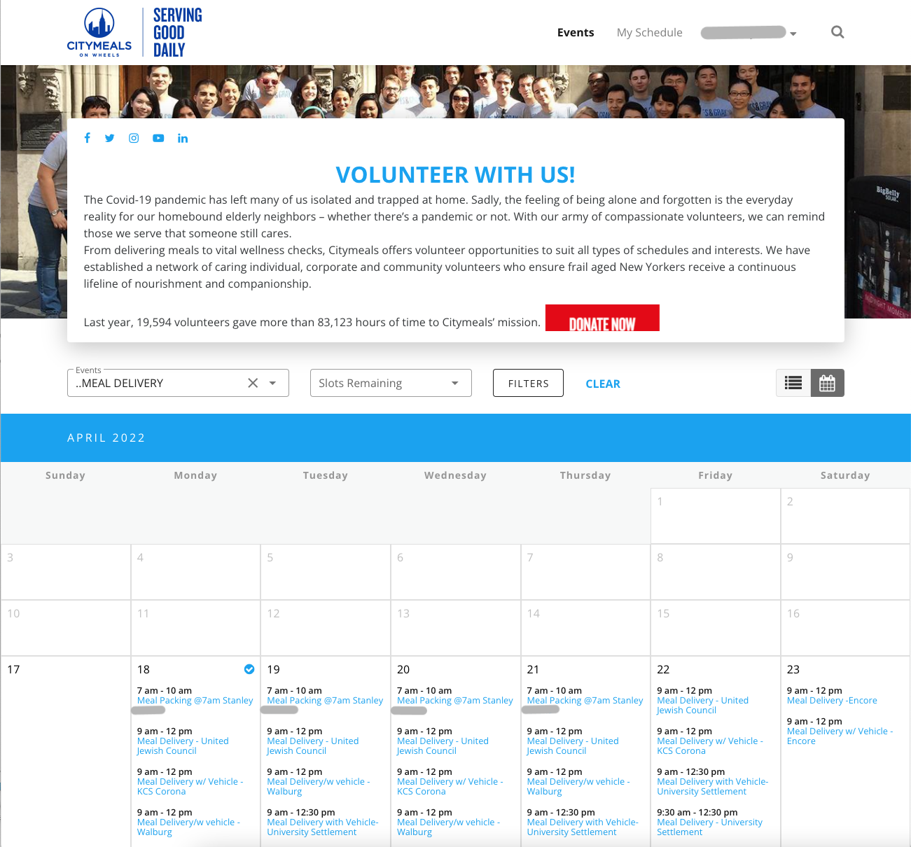
We assessed the current Citymeals on Wheels volunteer portal to find any notable difficulties or themes to be aware of. A notable area of improvement was navigational difficulties, such as being put directly into a calendar page rather than a homepage with scheduling and route information.
We wanted to build a knowledge base of non-profit volunteer portals to understand what had already worked for non-profit organizations such as Invisible Hands.
Having a delivery application in mind, we then looked into established commercial tools such as Uber and Doordash. This gave us inspiration on how to maximize usability for volunteers.
Consolidating Users into One
Volunteers cannot complete and log their deliveries with 100% efficiency. In addition, volunteers are not consistently connected with staff during their routes.
Volunteers run into roadblocks such as:
Lacking the correct food for orders,
Having trouble getting into buildings
Having no contact with the participants.
-
● “Can you think of anything that would improve how you receive this information?”
● “Can you tell me a bit about how and why you got started working with City Meals on Wheels?”
● “Can you describe how a volunteer goes about working with City Meals on Wheels?”
-
● “Can you describe a typical day volunteering with Meals on Wheels?”
● “How do you communicate with Meals on Wheels staff?”
● “What information is most important for you to receive from staff?”
● “Is there any information about the clients that is helpful to know going into a visit?”
Design for the Mobile Volunteer
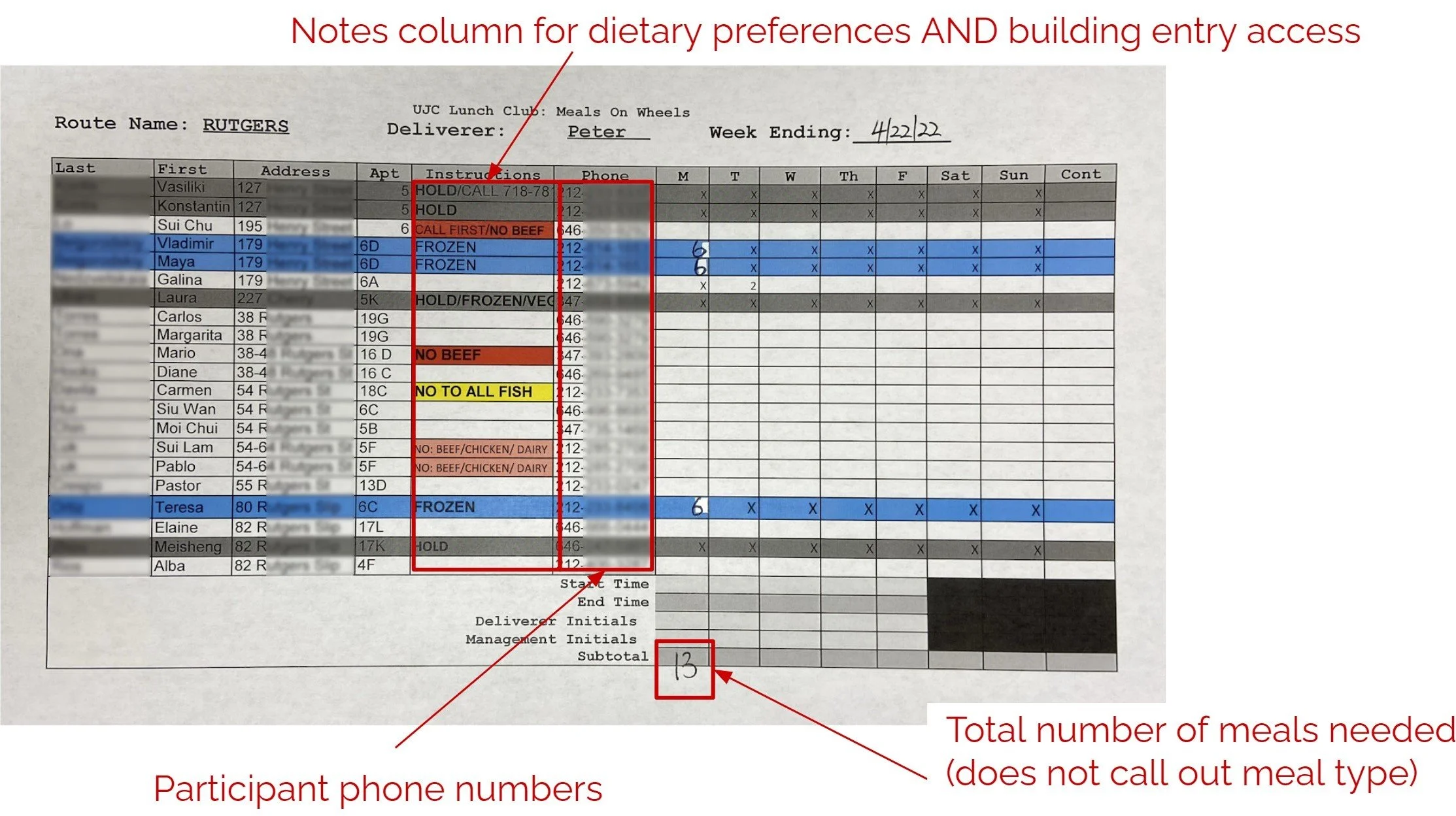
From outdated spreadsheet for a day…
Volunteers needed to reference a pre-printed excel document that provided a rudimentary way of conveying information.
The system was not adaptable to any change that may arise during the route
… to an online responsive design
A rework of the mobile website to reflect a responsive design can seamlessly be accessed on a desktop or mobile device.
Volunteers can access essential components such as mapping, participant info, and schedules when and where they need it most.
Usability testing prompted iterations on our prototype with simple fixes such as:
The “Sign-Up” button was changed to “Shift Sign Up” to reduce confusion about if volunteers were already signed in to the website.
The icon of City Meals on Wheels is now clickable and brings the volunteers back to the home page
The New Volunteer Experience
Results and Reflections:
Reflecting on the project, we did exhaustive research given the design sprint timeline. Creating a mobile-friendly website, while undoubtedly beneficial to the volunteers, differed from the outcome my team or I imagined. Creating a mobile application similar to the mobile website had been our goal. It would have brought in the mobile-friendly nature of a mobile website but eliminated some complex user interface problems that can arise on different browser applications. In addition, a mobile application would allow for a more centralized input for the volunteer. This means the user would rely less on pinging a server to constantly load a desired paged because the valuable information would be stored on the application itself.
Furthermore, we would have benefitted enormously from user testing in the field as the mobile website needed to be fully proven to us practically. Much of the valuable feedback we received was from showcasing the prototype to volunteers or allowing users to test it in a controlled environment. The more information gathered the further we could iterate on the design.


